Calculator App
Hello, welcome to this chapter of the course where we will build the first of the Flutter beginner projects, a simple calculator app with a good UI.
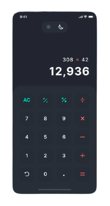
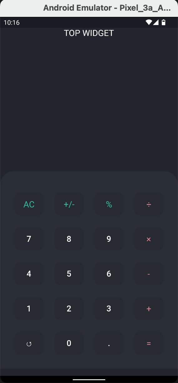
Below is the application that we will be developing step by step in this chapter.
Note: It is preferrable you have a basic foundation of Flutter before you tackle these tutorials. You can go through the tutorials in the course Flutter Tour or use the official Flutter docs.

Pause

Okay, now that you are done, let's begin from the same knowledge base. Quickly generating the app template that becomes our reference
flutter
flutter create calculator_app_doc|
Note: When running flutter run, the emulator should be running (or the physical device should be connected)
After generating the app, the codebase for lib/main.dart should be up to date as follows:
import 'package:flutter/material.dart';

void main() {
runApp(
    const MaterialApp(
    home: MyApp(),
    debugShowCheckedModeBanner: false,
    ),
);
}

class MyApp extends StatelessWidget {
    const MyApp({super.key});

    @override
    Widget build(BuildContext context) {
        return Scaffold(
          body: Container(
            height: MediaQuery.of(context).size.height,
            width: MediaQuery.of(context).size.width,
            color: const Color(0xff22252E),
            padding: EdgeInsets.only(top: MediaQuery.of(context).padding.top),
            child: const Text(
                "Calculator App",
                textDirection: TextDirection.ltr,
                style: TextStyle(
                color: Colors.white,
            ),
        ),
      ),
    );
  }
}
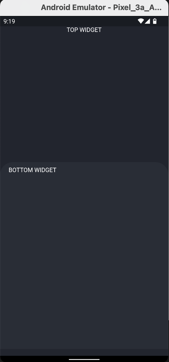
Now that we have a template of the calculator app, let's start with generating two widgets, the top part and the bottom part.
Then, we'll first focus on the bottom part, that is, the buttons for the calculator app.Let us create the two widgets that form the two parts of the calculator app
class MyApp extends StatelessWidget {
   const MyApp({super.key});

   @override
   Widget build(BuildContext context) {
      return Scaffold(
        body: Container(
           height: MediaQuery.of(context).size.height,
           width: MediaQuery.of(context).size.width,
           color: const Color(0xff22252E),
           padding: EdgeInsets.only(top: MediaQuery.of(context).padding.top),
           child: const Column(
            children: [TopWidget(), BottomWidget()],
           ),
       ),
     );
  }
}
The top part, the part that will encompass the widget for the toggle buttons for the dark and light mode, and also the view for the pressed actions for the buttons of the calculator.
class TopWidget extends StatelessWidget {
    const TopWidget({super.key});

    @override
    Widget build(BuildContext context) {
       return Container(
          height: MediaQuery.of(context).size.height * 0.4,
          child: const Text(
            "TOP WIDGET",
            style: TextStyle(color: Colors.white),
            textDirection: TextDirection.ltr,
         ),
       );
    }
}
The bottom part, the part that is the gridview for the buttons of the calculator app.
class BottomWidget extends StatelessWidget {
   const BottomWidget({super.key});

   @override
   Widget build(BuildContext context) {
      return Container(
         height: MediaQuery.of(context).size.height * 0.55,
         width: MediaQuery.of(context).size.width,
         padding: const EdgeInsets.symmetric(vertical: 10.0, horizontal: 20.0),
         decoration: const BoxDecoration(
            color: Color(0xff292D36),
            borderRadius: BorderRadius.only(
               topLeft: Radius.circular(30.0), topRight: Radius.circular(30.0))),
        child: const Text(
          "BOTTOM WIDGET",
          textDirection: TextDirection.ltr,
          style: TextStyle(color: Colors.white),
      ),
    );
  }
}
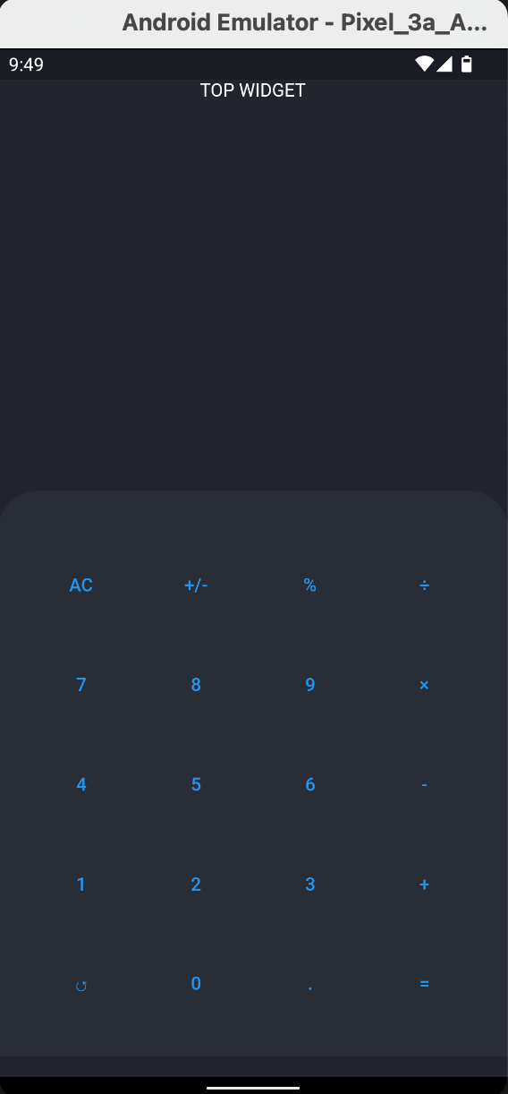
Before we render the buttons onto the gridview in the bottom widget, let us initialize an array of the data of the buttons. We'll do this in a file, buttons_data.dart
const buttonData = [
"AC", "+/-", "%", "รท", "7", "8", "9", "\u00D7", "4", "5", 
"6", "-", "1", "2", "3", "+", "\u21BA", "0", ".", "="];
Then, we'll render this in ButtonsPalette, injected as a descendant of the BottomWidget
I'll create the ButtonsPalette widget in a separate file, buttons_palette.dart, and import it to the lib/main.dart
// lib/buttons_palette.dart
import 'package:flutter/material.dart';
import 'package:calculator_app_doc/button_data.dart';

class ButtonsPalette extends StatelessWidget {
  const ButtonsPalette({super.key});

  @override
  Widget build(BuildContext context) {
    return GridView.count(
      crossAxisCount: 4,
      childAspectRatio: 1.15,
      children: [
        ...List.generate(
            buttonData.length,
            (index) => TextButton(
                onPressed: () {},
                child: Text(buttonData[index])))
      ],
    );
  }
}
Importing lib/buttons_palette.dart to the lib/main.dart as a descndant of the BottomWidget
// lib/main.dart
import 'package:calculator_app_doc/buttons_palette.dart';
import 'package:flutter/material.dart';
...

class BottomWidget extends StatelessWidget {
  const BottomWidget({super.key});

  @override
  Widget build(BuildContext context) {
    return Container(
      height: MediaQuery.of(context).size.height * 0.55,
      width: MediaQuery.of(context).size.width,
      padding: const EdgeInsets.symmetric(vertical: 10.0, horizontal: 20.0),
        decoration: const BoxDecoration(
          color: Color(0xff292D36),
          borderRadius: BorderRadius.only(
            topLeft: Radius.circular(30.0), topRight: Radius.circular(30.0))),
      child: const ButtonsPalette(),
    );
  }
}
Before we furnish the styles for the buttons in the ButtonsPalette, let's import the theme data we'll use in the MaterialApp widget. The contents of the lib/theme_data.dart are as follows
import 'package:flutter/material.dart';

ThemeData themeData = ThemeData(
textTheme: const TextTheme(
    titleSmall: TextStyle(fontSize: 15.0, color: Colors.white),
    titleMedium: TextStyle(fontSize: 25.0, color: Colors.white,fontWeight: FontWeight.w300),
    titleLarge: TextStyle(fontSize: 35.0, color: Colors.white, fontWeight: FontWeight.bold),
    bodyMedium: TextStyle(fontSize: 19.0, color: Color(0xff33BBA1)),
    bodySmall: TextStyle(fontSize: 19.0,color: Color(0xffE17D8B))
    ),
);
Importing lib/theme_data.dart to MaterialApp
import ...;
import 'package:calculator_app_doc/theme_data.dart';

void main() {
runApp(
    MaterialApp(
    theme: themeData,
    home: const MyApp(),
    debugShowCheckedModeBanner: false,
    ),
);
}
Now let's style the buttons of the ButtonsPalette widget. Note that the Center that wraps the TextButton prevents buttons from having unconstrained height and width, from where we set our height and width using the fixedSize attribute.

Also note, the first three buttons, index <= 2, have green text, and also, the last column buttons have red text.
You must do a hot restart for the theme data to be rendered in the buttons.
...
...List.generate(
    buttonData.length,
    (index) => Center(
          child: TextButton(
              style: TextButton.styleFrom(
                  shape: RoundedRectangleBorder(
                    borderRadius: BorderRadius.circular(12),
                  ),
                  backgroundColor: const Color(0xff272B31),
                  fixedSize: const Size(60, 50)),
              onPressed: () {},
              child: Text(
                buttonData[index],
                style: index <= 2
                    ? Theme.of(context).textTheme.bodyMedium
                    : [3, 7, 11, 15, 19].contains(index)
                        ? Theme.of(context).textTheme.bodySmall
                        : const TextStyle(
                            fontSize: 18.0, color: Colors.white),
              )),
))
...
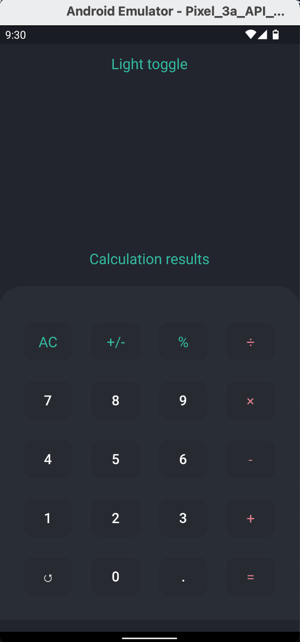
Now onto the top part of the calculator app, the widgets wrapping the dark mode toggle and the calculator screen results are in a column, one at the very top and the other at the very end, at the half part of the app.
Let us create two files, lib/light_toggle.dart and lib/calculation_results.dart.
class TopWidget extends StatelessWidget {
  const TopWidget({super.key});

  @override
  Widget build(BuildContext context) {
    return SizedBox(
      height: MediaQuery.of(context).size.height * 0.4,
      child: Container(
        padding: const EdgeInsets.only(top: 15.0, bottom: 25.0),
        width: MediaQuery.of(context).size.width,
        child: const Column(
          mainAxisAlignment: MainAxisAlignment.spaceBetween,
          children: [LightToggle(), CalculationResults()],
        ),
      ),
    );
  }
}
The template for the lib/light_toggle.dart file
import 'package:flutter/material.dart';

 class LightToggle extends StatelessWidget {
   const LightToggle({super.key});

   @override
   Widget build(BuildContext context) {
      return const Text("Light toggle");
   }
}
The template for the lib/calculation_results.dart file
import 'package:flutter/material.dart';

class CalculationResults extends StatelessWidget {
  const CalculationResults({super.key});

  @override
  Widget build(BuildContext context) {
    return const Text("Calculation results");
  }
}
Okay. Now, let us focus on the lib/light_toggle.dart codebase. First, we create a