Custom Scroll Views
In the earlier lessons, we've been working with List widgets, or Grid widgets separately. Here, we'll use CustomScrollView to create various scrolling effects, combining grids, lists and expanding headers. You use slivers to create various scrolling effects.
What are slivers?
A sliver is a portion of a scrollable area.
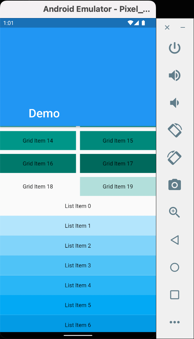
Let's create a CustomScrollView with slivers of grids and lists.
Let's create a CustomScrollView with slivers of grids and lists.
First things first, let's explain the parts of the CustomScrollView above.
SliverAppBar is collapsible, as opposed to AppBar which has a static height.
The SliverAppBar lets the app bar integrate with the scroll view so that it can vary in height according to the scroll offset or float above the other content in the scroll view.
The SliverAppBar has the expandedHeight property to specify the height of the appbar when expanded. You can use the MediaQuery or the double value to specify this.
It also has the properties pinned, floating, and snap.
~ Pinned
Whether the app bar should remain visible at the start of the scroll view.
The app bar can still expand and contract as the user scrolls, but it will remain visible rather than being scrolled out of view if pinned is true and otherwise if pinned is false.
~ Floating
Whether the app bar should become visible as soon as the user scrolls towards the app bar.
Otherwise, the user will need to scroll near the top of the scroll view to reveal the app bar.
~ Snap
If snap is true then a scroll that exposes the app bar will trigger an animation that slides the entire app bar into view. Similarly if a scroll dismisses the app bar, the animation will slide it completely out of view.
Video illustrations of the properties can be found here:
SliverGrid is a sliver that places multiple box children in a two dimensional arrangement.
The concept of this widget can be derived mostly from GridView widget talked about in the corresponding lesson.
SliverFixedExtentList ~ This widget creates an infinite list in the app. More on this lesson may be updated later.
Moving on to the next lesson!
The concept of this widget can be derived mostly from GridView widget talked about in the corresponding lesson.
SliverFixedExtentList ~ This widget creates an infinite list in the app. More on this lesson may be updated later.
Moving on to the next lesson!