Assets and Network Images
In a Flutter application, we can work with local images (in the assets folder), and/or network images (url-based).
Let's start with working with local images:
Create a folder, assets, in the root of the app. Then, create images folder in that created folder.
Next, go to pubspec.yaml in the root and then uncomment the block for assets: then modify it so that it can be like this:
Let's start with working with local images:
Create a folder, assets, in the root of the app. Then, create images folder in that created folder.
Next, go to pubspec.yaml in the root and then uncomment the block for assets: then modify it so that it can be like this:
Ensure the indentation of the modified block in the yaml file is space-specific as the one above or it will not work.
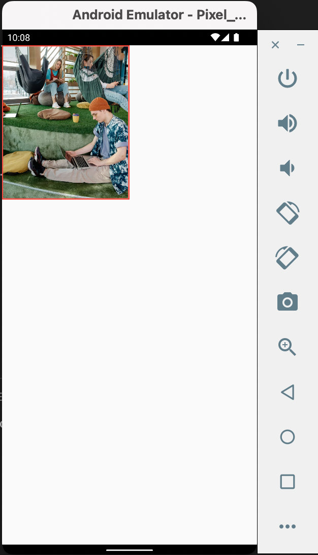
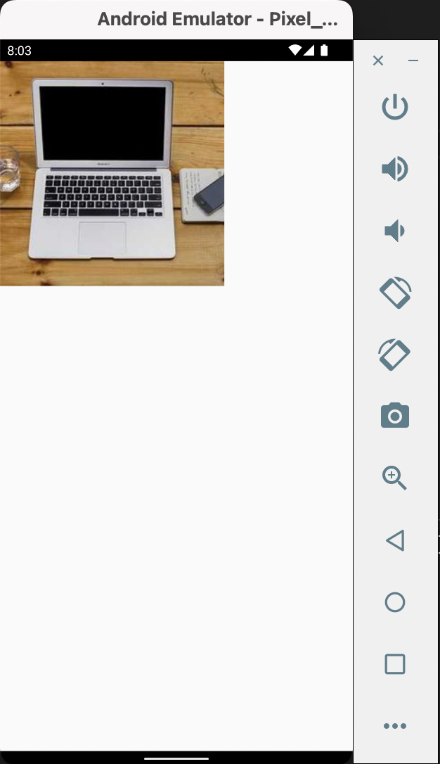
Next, add photos you will use, format-supported, in the images folder. For my case, I used sample.png
Note: If it does not pick the image, you might be forced to reinstall the app.
Next, add photos you will use, format-supported, in the images folder. For my case, I used sample.png
Note: If it does not pick the image, you might be forced to reinstall the app.
Now, in order to use url-based images, the codebase will be modified to use NetworkImage class as below:
Modifying image bounds
If, for instance, we'd want an image with rounded corners, we'll use the ClipRRect class as below:
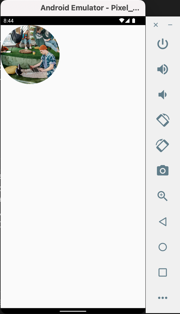
To get a fully rounded image, the class CircleAvatar wraps the image as below:
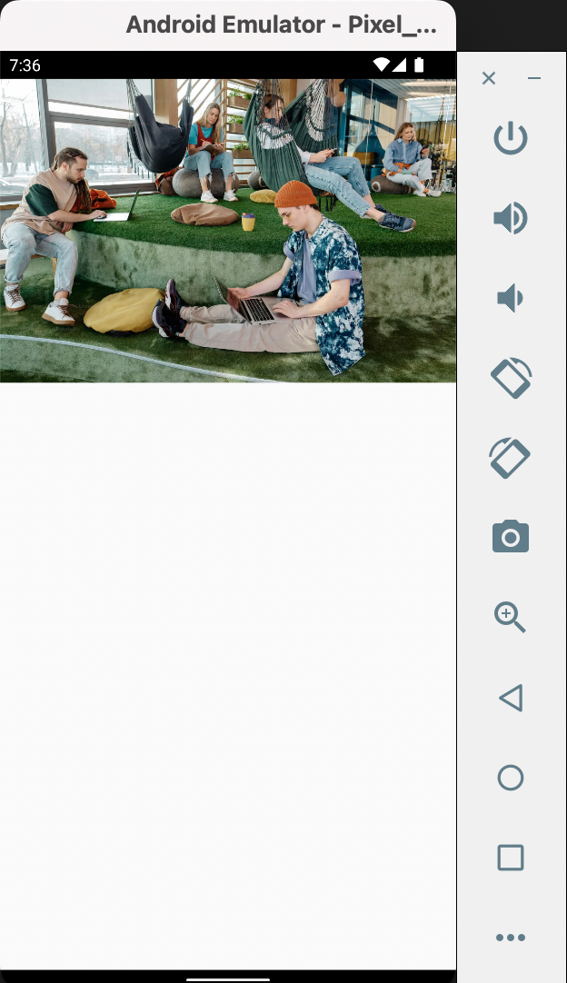
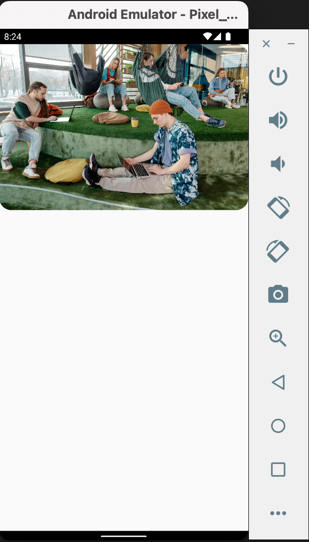
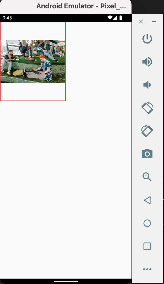
Now let's talk about an image being in a widget with a different aspect ratio. This makes the image to leave parts of the widget unoccupied.
Below is a codebase with Container having different dimensions hence different aspect ratios from the image itself.
Below is a codebase with Container having different dimensions hence different aspect ratios from the image itself.
There's a parameter for Image.asset called fit where you can pass an enum value for BoxFit to specify how the image fills the Container.
BoxFit.fill distorts the image's aspect ratio so that it can fill the Container.
BoxFit.cover let's the image fill the Container without distorting the aspect ratio while cliping the sides of the image.
BoxFit.fitHeight and BoxFit.fitWidth depends on the aspect ratio of the image, that is, which side is more dorminant in size and hence should be used to fill the Container.
BoxFit.contain was the default. I may not say much for BoxFit.scaleDown so look into it.
I'll use BoxFit.cover because I'd recommend it more than the others.