Material 3
To share colors and font styles throughout an app, use themes. You can either define app-wide themes, or use Theme widgets that define the colors and font styles for a particular part of the application.
In fact, app-wide themes are just Theme widgets created at the root of an app by the MaterialApp.
In fact, app-wide themes are just Theme widgets created at the root of an app by the MaterialApp.
App-wide theme
Let us define an app-wide theme using the ThemeData at the root to the MaterialApp constructor.
ThemeData has two important attributes, colorScheme and textTheme.
ThemeData has two important attributes, colorScheme and textTheme.
colorScheme
Defining a primary color on the Material Theme (primary colors are used for key components across the UI, such as the floating action button, prominent buttons, and active states), the colorScheme will be as below:
textTheme
And for textTheme, let's say we'd like to define custom font stylings for each variant of our font in the Flutter App, we do as below:
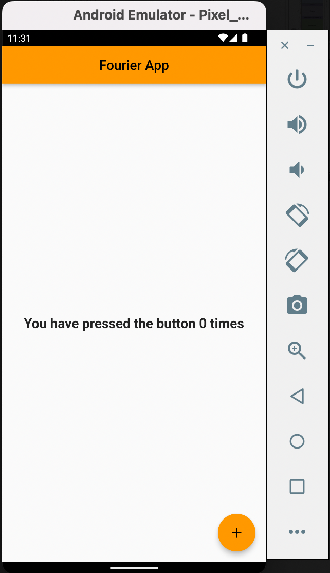
So after defining the TextTheme variant bodyMedium in ThemeData in MaterialApp constructor, let's use it in our dynamic Text widget in its style parameter. This is in the counter_action.dart
Before we go on further, I want to point out something. Some parts of the application identity text with global style variants. For instance, the Text in the AppBar is titleLarge and the Text in the Center is bodyMedium. So, without even explicitly assigning that variant textTheme to the Text as done in the immediate snippet above, it will pick.
But you must explicitly assign if it's a different variant you intend to use, or if not sure.
But you must explicitly assign if it's a different variant you intend to use, or if not sure.
Using Theme widgets
If you don't want your entire app to be styled in a particular theme, use the Theme widget for a particular section of the application.
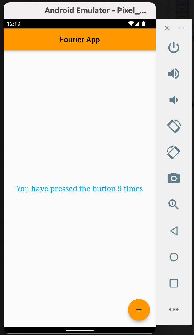
In the above snippet, Theme widget is used to set the splash color of the floating action button to yellow when clicked.
Extending the parent theme
Rather than overriding everything, it often makes sense to extend the parent theme. You can handle this by using the copyWith() method.