Building the buttons
Let's now handle the buttons UI for the calculator app. We declare an array for all the symbols and numerics for all the buttons in the UI. I'll use the reactive data declaration.
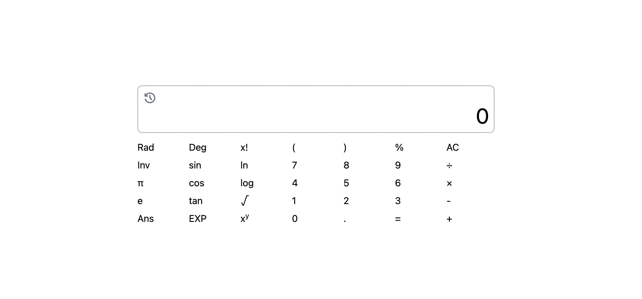
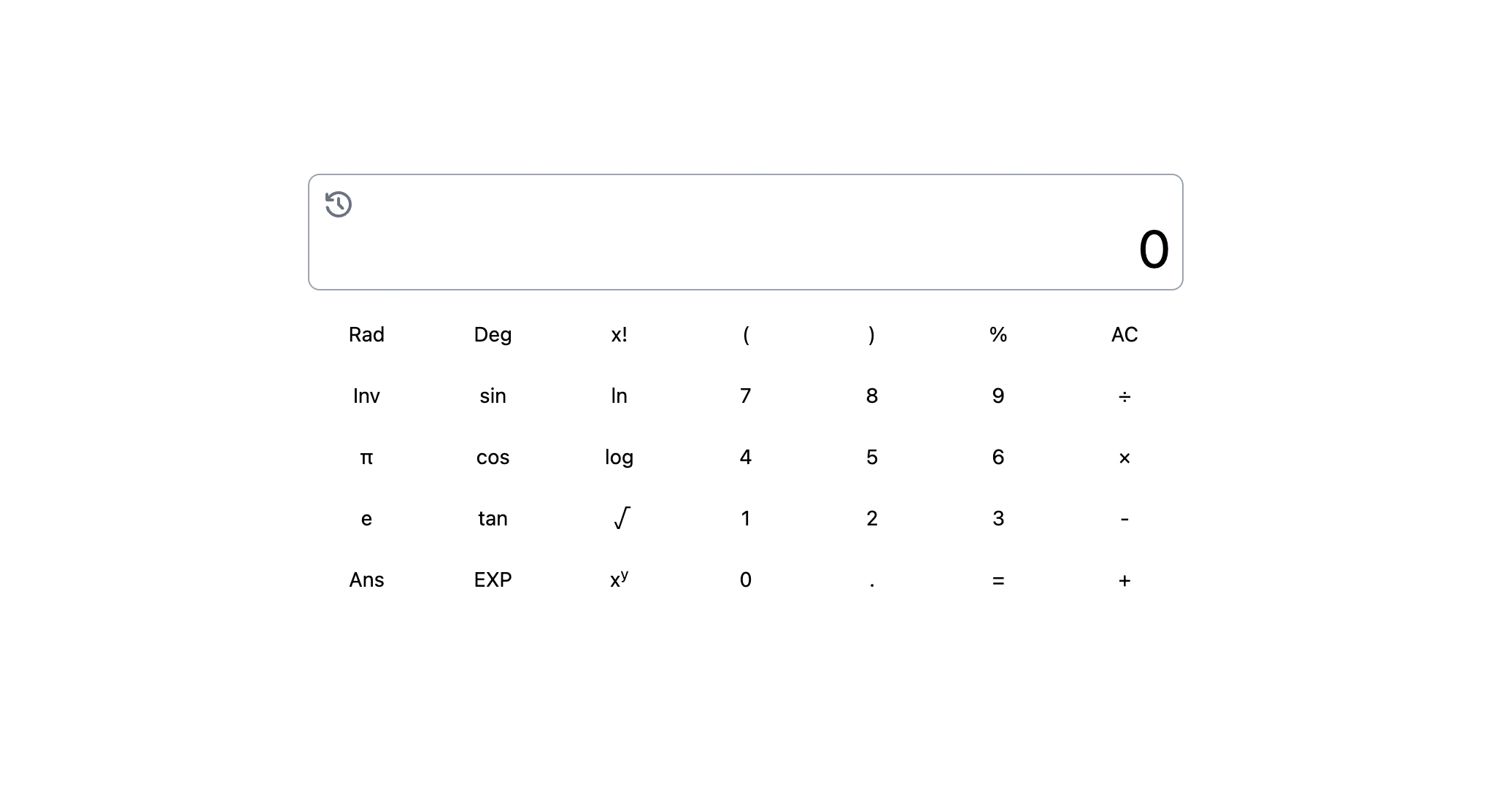
Onto rendering the data onto the DOM for the application using the moustache syntax, we use grid layout of 5 by 7, that is, 5 rows and 7 columns.
We introduce a concept here, list rendering. In Vue, we use v-for to loop through an array and access each item. When only needing the item and not also the index, we can define it as so:
In Vue's v-for loop, the "key" attribute is used to identify each item in a list so that Vue can efficiently update the DOM when items are added, removed, or reordered.
Without a unique identifier, Vue may have to re-render the entire list when changes occur, leading to poor performance.
The "key" attribute should be a unique value for each item, such as an ID or index, and it should not be changed during re-renders.
Without a unique identifier, Vue may have to re-render the entire list when changes occur, leading to poor performance.
The "key" attribute should be a unique value for each item, such as an ID or index, and it should not be changed during re-renders.
📂list rendering ✅
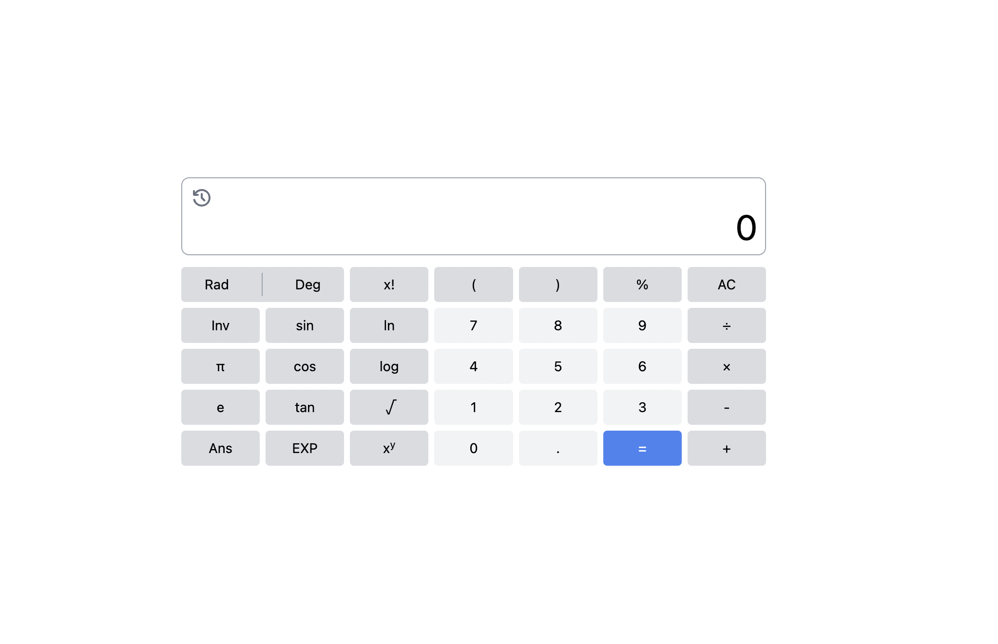
Let's integrate the colors and themes for the final UI in order to meet the final UI look.
Because all buttons will have a base shared look, so let's declare a css property for this in the style.css using the @apply attribute.
Because all buttons will have a base shared look, so let's declare a css property for this in the style.css using the @apply attribute.
Next, we know that in the UI, some buttons have different color themes from others, let's set that. Let's set another array for the basic color theme buttons which will be used for checking and setting of the necessary color themes for each button.
Note: Ensure that the three custom colors used in the color rendering below are extended in tailwind.config.js for tailwindcss.
Note: Ensure that the three custom colors used in the color rendering below are extended in tailwind.config.js for tailwindcss.
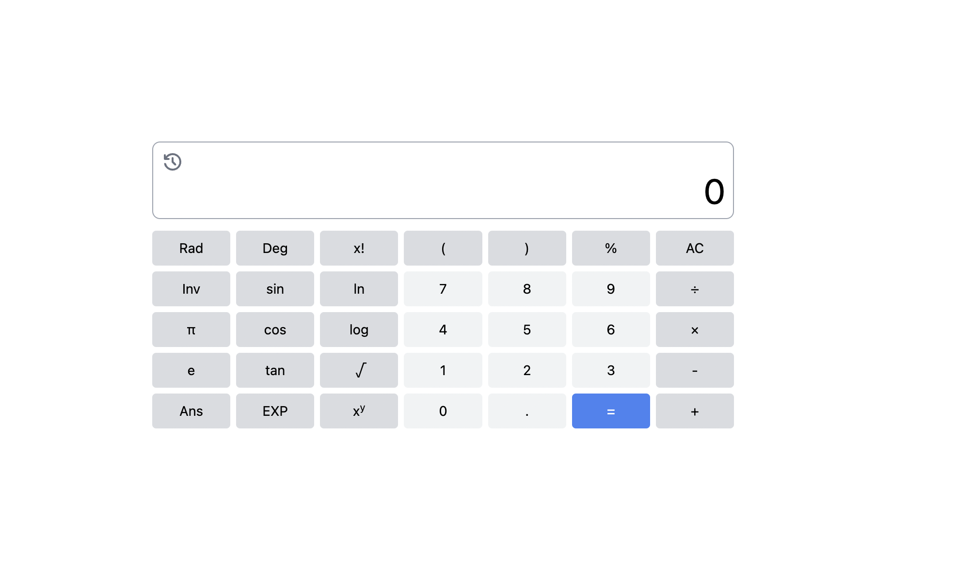
In class binding, we can assign CSS classes dynamically based on the data evaluated and computed properties. It's like using if-else to set classes. I've used chained ternary operator to set both the basic, complex and highlight color themes.
The chained operator evaluates from outwards going inwards.
The chained operator evaluates from outwards going inwards.
🔥Class bindings ✅
Finishing on UI buttons
Finally, note that the first two buttons are a bit different from the others, in that they have a unique layout.
For this reason, I'll have to define their styles separately and hence the array for buttons will now start from the third one and not from the first one as initially styled.
For this reason, I'll have to define their styles separately and hence the array for buttons will now start from the third one and not from the first one as initially styled.
On the next bit, that is, the next lesson, let's bundle each part of our application into components.